Independent research · Market entry
USFK-Pay
What stops a foreigner at a Korean payment screen is not the language.
- Role
- Sole researcher · interview design · fake-door testing
- Period
- 8 months, 2023 – 2024
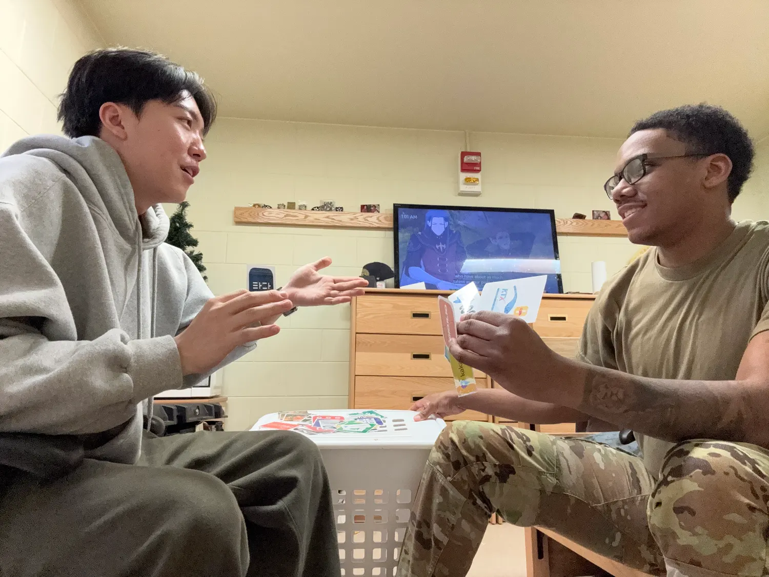
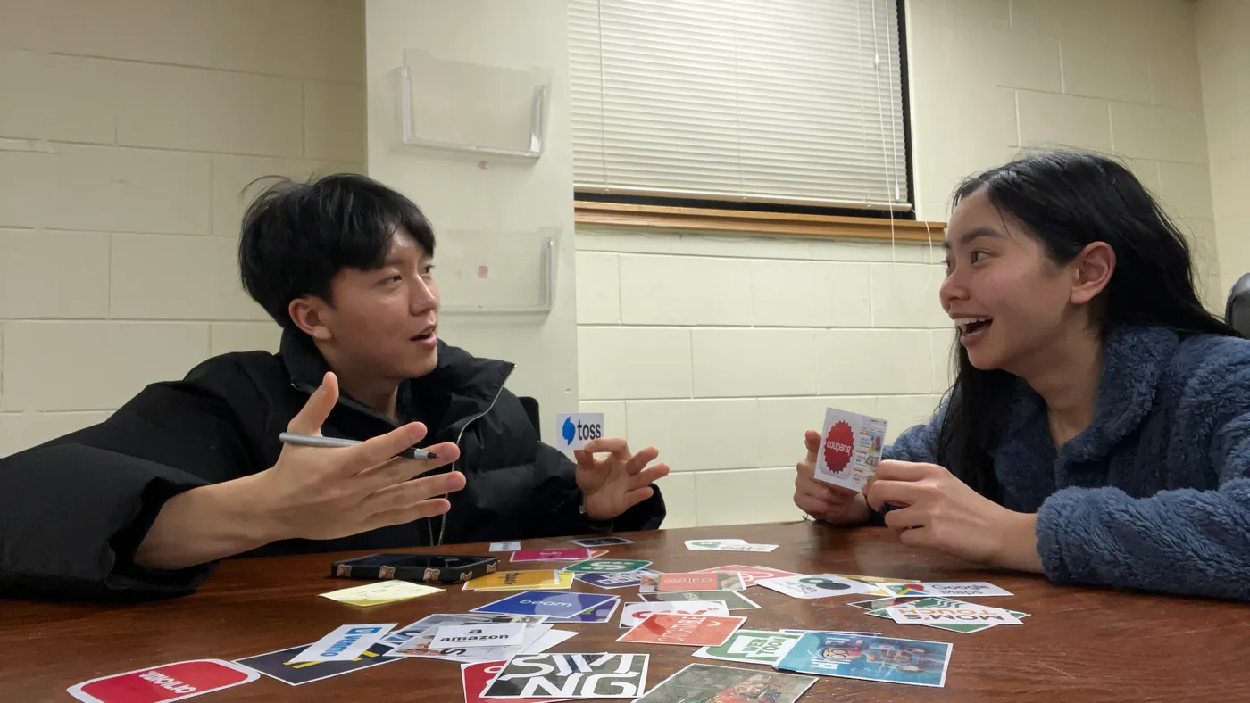
There is one place you can meet American users without leaving Korea: a U.S. Army base. I was inside one as a KATUSA soldier, and I turned that access into a research design.
Language was the symptom. Identity mismatch was the disease.
One afternoon I told a soldier she could order from Coupang without an alien registration card. Google had told her — and most of her unit — that she needed one. She did not believe me, so I walked her through it. The order went through. Then she filmed it on her phone, because she did not trust her own memory of what had just happened.The friction was not language. It was a financial and digital system asking for resident identity infrastructure from people whose passport-stamped identity does not fit the form.
Five needs from the interviews
| Need | What the interviews showed |
|---|---|
| Accessibility | They wrongly believed Coupang required an alien registration card. The gap was information, not features. |
| Usability | They gave up on Korean apps when they could not find the language setting. “I don’t know how to set it in English.” |
| Personalisation | They wanted to choose their own card design, as Cash App lets them. |
| Incentives | Told that Toss pays you for walking: “Oh my god! I love that!” |
| Integration | They wanted fewer cards in the wallet: transit and payment on one card. The transit-card conclusion starts here. |
The first test failed
By the lean methodology I had committed to, the disciplined move was to kill it. I almost did.
A poster by the barracks: ~250 reached, 2 emails
My own go/no-go threshold was 10%. The result was 0.8%.
Instead of dropping the hypothesis I made the poster itself the unit of analysis — was the data rejecting the hypothesis, or the artifact?
Ten soldiers read the poster aloud
A think-aloud protocol. The information hierarchy was confused, the value proposition was buried in jargon, and cognitive load collapsed interest before the email field.
Applying Hick’s Law, I cut the choices and rebuilt the hierarchy.
A month on a bus-terminal poster: 13 emails
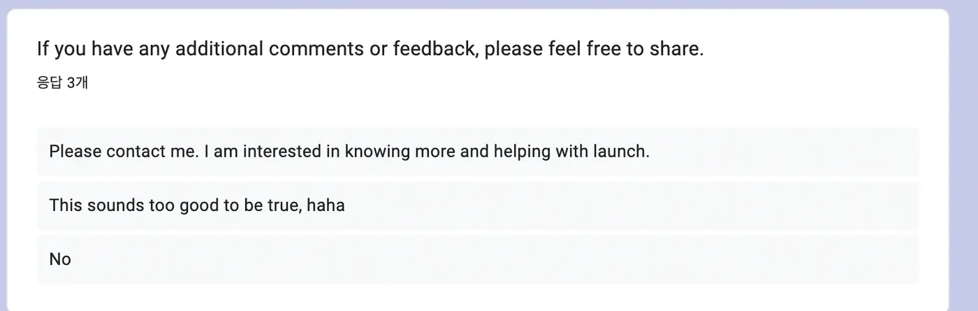
3.6%. One soldier resubmitted twelve days later after correcting an email typo; another wrote in the comment field: “Please contact me, I want to help with launch.”
Three years on, what I take from it is not the conversion rate. It is the discipline of staying with a 0.8% result long enough to ask whether the data was rejecting the hypothesis or the test.
What blocked the research was not the data
My company commander blocked the first test on privacy grounds. The disciplined move was to escalate or quit. I negotiated through the Public Affairs Office instead, reframing the test from “data collection” to “preference survey” — language the institution could accept. Permission for exterior posting was granted.
Method
The smaller the sample, the stricter the procedure has to be. Everything from recruitment to coding was documented.
- 01Individual recruitment
Recruited one by one, including the executive officer and unit commander. Only soldiers 4+ months in Korea who visit Seoul twice a month or more
- 02Semi-structured interviews
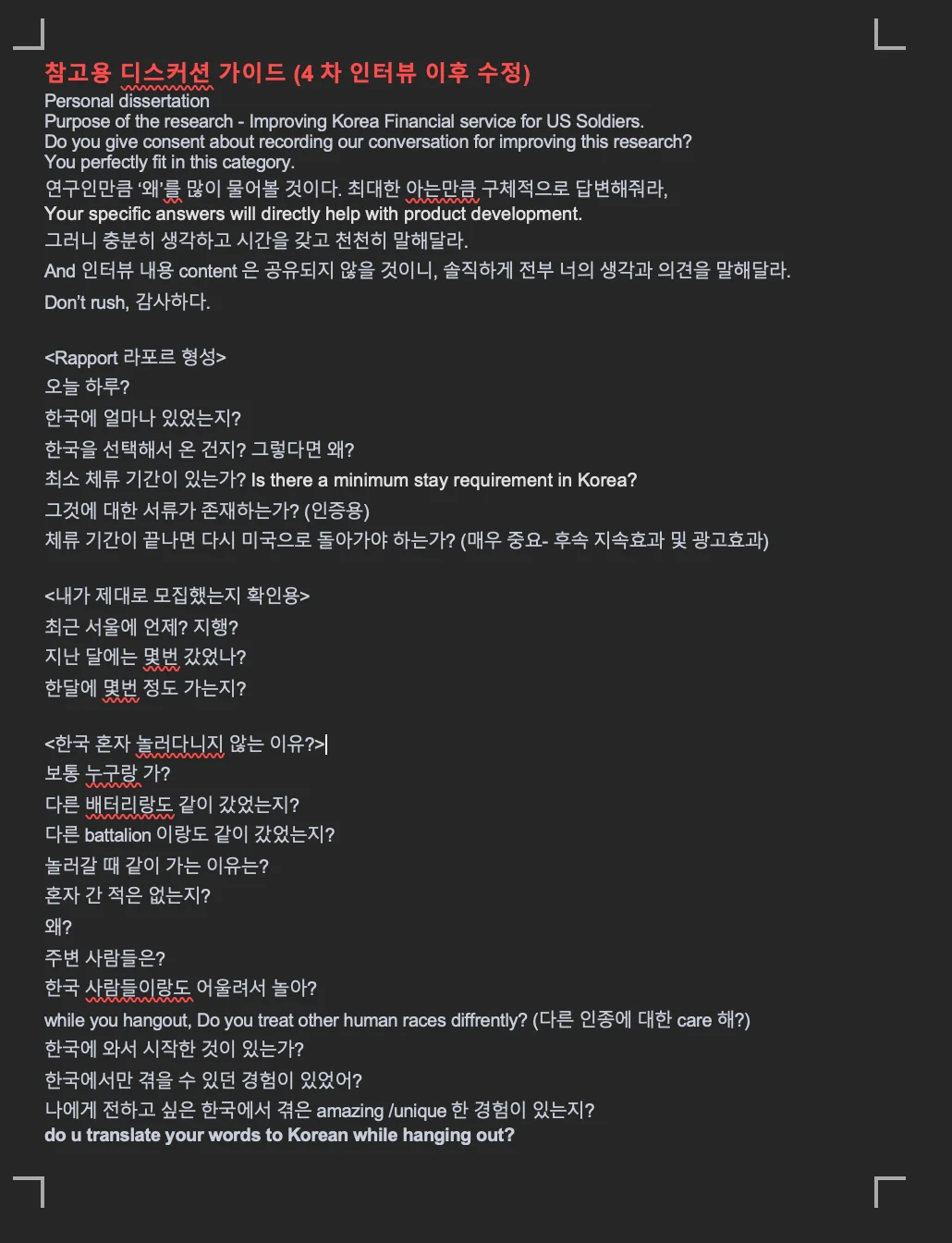
~30 minutes each, recorded, transcribed and coded
- 03AS-IS / TO-BE analysis
Comparing the current payment experience against alternatives
- 04Fake-door test
Measuring real demand for a product that did not exist
The conclusion
The entry point was transit, not transfers or cards
Taken together, the interviews and the fake-door tests pointed at transit payment as the friction they hit most often and could least avoid.
It answered “where do you enter?” rather than “what do you build?”
Treating the recruitment poster as UI
The first poster drew almost nothing. I treated that as a usability problem rather than a failure — having soldiers read it aloud and watching where they stalled.
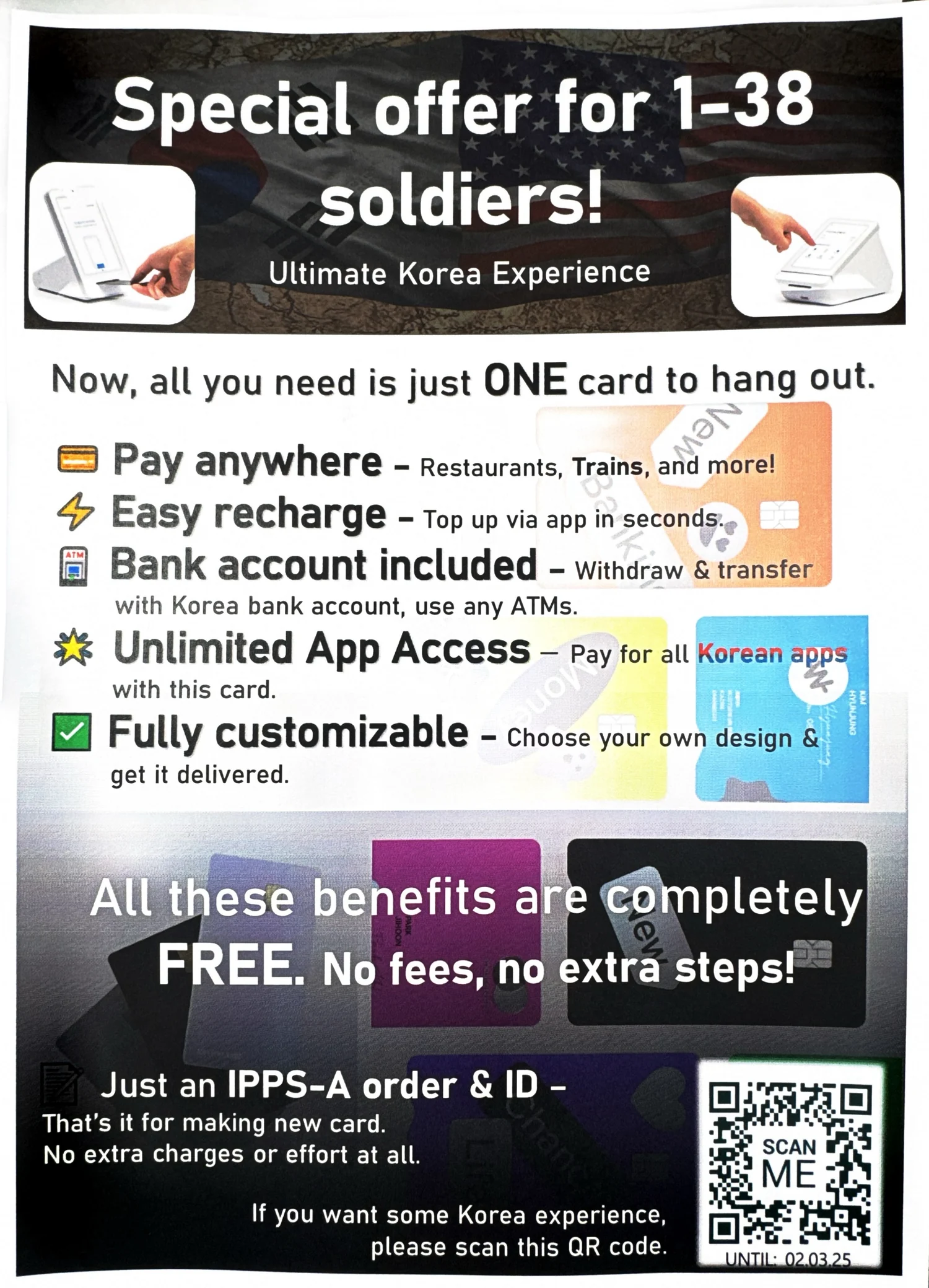
Three competing CTAs collapsed into one action
The strongest benefit reads first
Feature lists rewritten as benefits
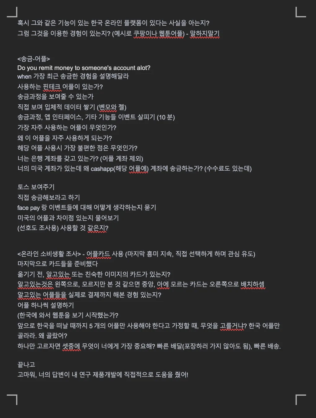
Research artifacts